The Graph That Should Be Front-Page News
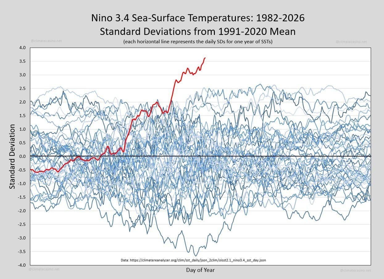
This article discusses a concerning graph showing record-breaking sea-surface temperatures in the Niño 3.4 region of the Pacific. It emphasizes that these are direct observations of climate change rather than computer models.
Every so often the Earth produces a signal that is impossible to ignore. This graph is one of them. It shows sea-surface temperatures in the Niño 3.4 region of the equatorial Pacific, one of the most important parts of the Earth's climate system. Each blue line represents a different year since 1982. The red line is this year. It doesn't just set a new record. It has departed entirely from the range of previous observations.
Get the full story
Sign up for Headlinne to unlock AI insights, political bias analysis, and your personalized news feed.
Create free accountAlready have an account? Sign in